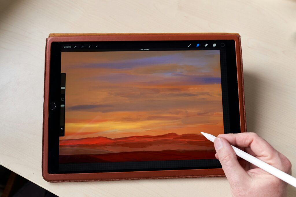
Color isn’t just decoration. It’s narrative. Smart vloggers know that color cues viewers faster than dialogue or text. The tone of a video is often set before a single word is spoken, just by the first color frame they see. Warm tones pull people in, cool ones add detachment or calm. High contrast brings urgency, pastels slow things down. When used right, color creates pacing.
Intentional use of color adds layers. Whether it’s matching wardrobe to backdrop to create visual cohesion or flipping the palette mid-video to signal a shift in theme, every choice matters. This is where understanding color theory becomes a weapon. Complementary hues, triadic schemes, mood gradients — it’s all the stuff painters and designers lean on instinctively. Creators who take time to learn this gain an edge.
Viewers might not always notice color consciously, but they feel it. And when you control what your audience feels, you hold their attention longer. That’s the difference between just uploading a vlog and crafting a visual experience.
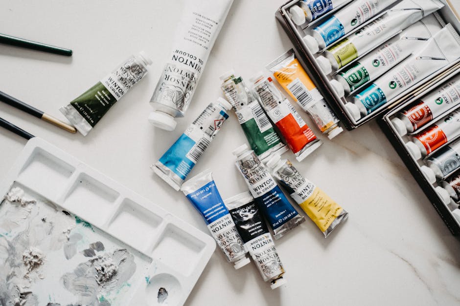
Color is the foundation of everything in painting. Let’s break it down. Primary colors are red, blue, and yellow. These are the big three—you can’t mix them from anything else. Secondary colors come from mixing the primaries: red and yellow make orange, blue and yellow make green, red and blue make purple. Go one level deeper and you get tertiary colors. These are mixes of a primary with a neighboring secondary, like red-orange or blue-green. Think of them as the in-betweens that give depth.
To keep it all straight, painters use the color wheel. It’s not just art class stuff. The wheel helps show how colors relate and clash. You can use it to build harmony or tension in your work. When paired well, colors pop. When misused, they muddy your message.
Then there’s the talk of warm versus cool. Warm tones—reds, oranges, yellows—bring heat and energy. Cool tones—blues, greens, purples—add calm and space. Use warm tones to move forward, cool tones to pull back. It matters when you’re setting a mood or guiding someone’s eye across the canvas. Mastering this gets your work past beginner level and into something people feel.
Color isn’t just decoration anymore. For vloggers, it’s a tool to grab attention, shape emotion, and build visual identity. To do that well, you need to understand how color schemes work.
Complementary colors like blue paired with orange or red with green create sharp contrast. They pop. Use them when you want a shot to stand out or add visual tension. Dramatic edits, intense moments — these combos pack a punch.
Analogous colors — think purples, blues, and teals — sit next to each other on the color wheel. They create a sense of calm and connection. Great for creating a mood or building consistency across scenes without overwhelming the eye.
If you want more energy without turning every frame into a clash, split-complementary and triadic schemes give you options. They balance boldness and control by mixing varied colors with space. These setups keep things dynamic but still easy to watch.
Bottom line: color isn’t guesswork. It’s a creative decision that can shift how your content feels. Make it count.
Color grabs attention, but it’s value—how light or dark a color is—that does the heavy lifting in vlogging visuals. Value defines contrast. It shapes depth. It decides what stands out on a screen and what fades into the background. Even black-and-white visuals can feel rich and dynamic when value is used well. This is why it often matters more than the colors themselves.
Hue is where it all starts. It’s the actual name of the color—red, blue, green. It gives character and mood, but on its own, it’s not enough. Without value contrast, even the boldest hues can fall flat.
Saturation adds another layer. It’s the intensity of a hue, from soft and muted to loud and punchy. Subtle saturation can look refined. High saturation pops off the screen. Vloggers who understand how to balance it can guide the viewer’s eye without overloading the frame.
The pros know color isn’t just aesthetic—it’s a tool. Mastering value, hue, and saturation lets creators shape the mood and message of every frame.
Mastering Color: Discipline, Depth, and Impact
Working with color isn’t just about aesthetics—it trains your eye, sharpens your technique, and strengthens your voice as a visual creator. In 2024, vloggers breaking into visual storytelling, tutorials, and even art-driven content trends will benefit from going back to the fundamentals.
The Power of a Limited Palette
Limiting your color choices isn’t restrictive—it’s strategic. A smaller palette forces clarity and intentionality and teaches visual discipline that translates into more polished, consistent content.
- Builds restraint and control in your compositions
- Sharpens your ability to create cohesion across scenes and thumbnails
- Makes color grading and branding more efficient
If you’re feeling stuck creatively, cutting your palette down to three or four base colors can open up new possibilities.
Mixing Neutrals by Hand
Learning to create neutrals from scratch instead of relying on pre-made tones deepens your understanding of how colors interact.
- Develops layering instinct and tonal control
- Fine-tunes your eye for warmth, coolness, and balance
- Helps you adapt lighting across different environments naturally
This practical skill pays dividends in both digital content and physical artwork. It’s especially useful for creators building visual continuity across their channel or social media platforms.
Bring Color Choices to Life Through Layering
Layering isn’t just about adding depth—it’s about connecting color decisions with story and structure. Each layer tells part of the narrative, whether you’re working in paint, software, or on video.
- Start with large, confident blocks of color
- Build complexity through glazes, textures, or secondary tones
- Use layering to signal emphasis, movement, or emotion
A well-layered frame or canvas keeps the viewer engaged. It’s not about technical perfection—it’s about clarity and intent. When in doubt, simplify and let your color choices do the heavy lifting.
Balance in painting isn’t about spreading things out evenly. That leads to a lifeless image—flat, forgettable. Real balance comes from contrast and weight. You want visual tension, not symmetry. Let one element lead, then support it with accents that move the viewer’s eye across the canvas.
Think in terms of dominance. That could be color, form, texture, or even negative space. Pick one—and let it be the loudest voice in the room. The rest? They’re the backup band. Use them to guide the eye from your focal point outward, and then gently back again. Sharp angles, bright tones, or detailed areas all make strong accents if used with control.
The trap is going overboard. If everything stands out, nothing does. Your focal point gets lost in the noise. So step back. Squint at your work. If the main subject doesn’t clearly own the piece, pull back the volume on the rest. Simplicity lets impact hit harder.
Training Your Eye: Color Mastery From Sketchbook to Studio
Studying the Masters of Color
Understanding color begins by learning from those who wielded it with intention and emotion. Artists like Van Gogh and Monet were not just masters of technique—they were masters of perception. Studying their work can sharpen your own sensitivity to hue, temperature, and contrast.
- Van Gogh used exaggerated, emotionally charged color to convey mood and inner states.
- Monet explored subtle tonal shifts and natural light to build immersive landscapes.
- Analyze paintings in terms of how color directs the eye, creates atmosphere, or builds form.
- Pay special attention to how these artists used complementary colors and value contrasts.
Tip: Visit a museum, skim a high-res art database, or recreate a painting using color swatches to better internalize the masters’ choices.
Learn to Recognize Undertones
Training yourself to see undertones—not just the top-level color—can drastically improve both painting and digital color work. Everything from skin tones to shadows contain unexpected hues that add depth and realism when captured correctly.
- Start with simple objects and try to identify warm vs. cool undertones.
- Practice matching colors with paint or digital tools based on the underlying hue.
- Use side-by-side comparisons to notice subtle shifts you might otherwise miss.
Focus on observing color in different lighting scenarios throughout the day. Natural light will help you build a more refined color vocabulary.
Daily Sketchbook Color Drills
Consistency builds intuition. A dedicated sketchbook practice takes color theory off the page and turns it into instinct.
Try incorporating these exercises:
- Limited Palette Studies: Work with only a few colors to learn how to mix creatively.
- Color Mapping: Paint the same subject in multiple color schemes.
- Mood Challenges: Choose a theme (calm, tension, joy) and use only color to express it.
Over time, these simple habits build not just skill, but an internal color compass you can rely on in any medium.
Developing color mastery is not just about theory. It’s about training your eyes to see and your hand to respond. With daily commitment, your use of color becomes less analytical and more intuitive.
Muddy colors are one of the most common visual issues in vlogs, and they usually come down to poor lighting, bad white balance, or stacking too many color corrections in post. When colors fight each other on screen, the image gets flat, lifeless—hard to watch. The fix is simple but disciplined: shoot with clean, balanced lighting, avoid over-editing, and pick a color palette before you hit record.
Reference photos can help, but overrelying on them is a trap. Cameras and lighting setups behave differently than still images. You can’t always plug in a look and expect it to work across motion and mood. Instead, use references as a loose guide, not a formula. Adapt them to your actual environment.
Finally, vloggers often forget that temperature isn’t just aesthetic—it’s emotional. A warm tone in a heavy, introspective video can feel jarring. A cool, sterile color grade on a joyful day trip? Also wrong. Good visuals support the feeling of the moment. Match temperature to tone, and your vlog stays immersive without calling attention to itself.
Understanding color goes way beyond picking a palette that looks good. In vlogging, it shapes how scenes feel, how details pop, and how your story flows. Color helps guide the eye, break up visual monotony, and bring texture to life—especially if you’re shooting in spaces that lack natural contrast.
For example, pairing warm tones with textured backdrops like raw wood or fabric gives depth even in short shots. On the flip side, cooler palettes can help highlight smooth surfaces or subtle motion. It’s less about showing off color theory and more about using color as scaffolding for your frame. Think of it like this: texture tells the viewer where to look. Color tells them how to feel about it.
Still not sure where to start? Try flipping the frame into black and white to see where the eye gets stuck. Then add or tweak color where it needs push or pull.
Explore more in How to Sculpt with Clay – Beginner’s Guide to Form and Texture
One last tip: experiment relentlessly. Rules are training wheels. Once you’re rolling, leave them behind.
 Tavianna Vandellen has opinions about art movement discussions. Informed ones, backed by real experience — but opinions nonetheless, and they doesn't try to disguise them as neutral observation. They thinks a lot of what gets written about Art Movement Discussions, Creative Inspiration and Ideas, Artist Spotlights is either too cautious to be useful or too confident to be credible, and they's work tends to sit deliberately in the space between those two failure modes.
Reading Tavianna's pieces, you get the sense of someone who has thought about this stuff seriously and arrived at actual conclusions — not just collected a range of perspectives and declined to pick one. That can be uncomfortable when they lands on something you disagree with. It's also why the writing is worth engaging with. Tavianna isn't interested in telling people what they want to hear. They is interested in telling them what they actually thinks, with enough reasoning behind it that you can push back if you want to. That kind of intellectual honesty is rarer than it should be.
What Tavianna is best at is the moment when a familiar topic reveals something unexpected — when the conventional wisdom turns out to be slightly off, or when a small shift in framing changes everything. They finds those moments consistently, which is why they's work tends to generate real discussion rather than just passive agreement.
Tavianna Vandellen has opinions about art movement discussions. Informed ones, backed by real experience — but opinions nonetheless, and they doesn't try to disguise them as neutral observation. They thinks a lot of what gets written about Art Movement Discussions, Creative Inspiration and Ideas, Artist Spotlights is either too cautious to be useful or too confident to be credible, and they's work tends to sit deliberately in the space between those two failure modes.
Reading Tavianna's pieces, you get the sense of someone who has thought about this stuff seriously and arrived at actual conclusions — not just collected a range of perspectives and declined to pick one. That can be uncomfortable when they lands on something you disagree with. It's also why the writing is worth engaging with. Tavianna isn't interested in telling people what they want to hear. They is interested in telling them what they actually thinks, with enough reasoning behind it that you can push back if you want to. That kind of intellectual honesty is rarer than it should be.
What Tavianna is best at is the moment when a familiar topic reveals something unexpected — when the conventional wisdom turns out to be slightly off, or when a small shift in framing changes everything. They finds those moments consistently, which is why they's work tends to generate real discussion rather than just passive agreement.