What Mixed Media Adds to Atmosphere
Atmosphere isn’t just an aesthetic it’s the emotional temperature of your visual story. It’s what makes a still image feel like it’s breathing, or a quiet background hum with tension. Good atmosphere pulls viewers in without explaining itself. It’s subtle, but powerful.
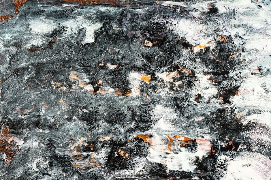
To build it, artists are leaning into the blend of tactile and digital. Grainy ink textures, rough edges from torn paper, the unpredictable flow of watercolor these analog elements give a piece warmth and imperfection that digital tools often lack on their own. But digital tech isn’t the enemy here. In the right hands, it’s the amplifier. Custom brushes mimic charcoal without the mess. Blend modes can recreate the feel of old film overlays. Light leaks, soft gradients, textured fades these tools bring analog gestures into digital control.
Layering both worlds is where atmosphere really comes alive. Scan in a rough pencil sketch. Drop in a translucent wash. Add digital lighting that complements the grain, not fights it. Treat each layer like a member of a band instead of parts of a machine. Analog brings the soul. Digital fine tunes the structure.
Balance is key. The goal isn’t to flex complexity for its own sake, but to create mood with intent. You’re not just showing something. You’re making someone feel it.
Foundational Tools You’ll Need
Creating atmosphere with mixed media starts with knowing your tools. The traditional base still matters. Ink washes give you organic flow and streak. Acrylics offer bold coverage and fast drying times ideal for texture. Charcoal plays the role of depth maker, instantly adding grit and shadow.
On the digital side, your drawing tablet is the new sketchbook. Apps like Procreate, Clip Studio Paint, and Photoshop give you precision control. Use soft edged brushes and pressure settings to mimic natural motion. Blending modes (Multiply, Overlay, Soft Light) layer mood fast without washing things out. Try scanning your physical work at high resolution 300 dpi minimum to preserve subtle textures.
Not every setup needs to be fancy. A mid range tablet, a stylus with solid pressure sensitivity, and one good app is enough. Set up custom brush libraries that match your traditional style. Save presets you love. Always work in layers physical and digital so you can riff, refine, or pull back when things start to smother the vibe.
For a broader overview of essential tools and workflows, check out this digital painting basics guide.
Layering Techniques That Create Atmosphere
Atmosphere isn’t about throwing more at the canvas. It’s about control and restraint. Subtle lighting shifts can do more than a dozen flourishes. This is where opacity settings come into play. Dialing back a glow layer to 20% can suggest a fading sun. A translucent wash over a base image can mimic early morning fog. Think minimal, but intentional.
Blending image scans with brush textures adds another layer of realism. You might start with a charcoal sketch, scan it, then bring it into your digital workspace. Applying a grainy brush at low opacity underneath that scan makes it feel grounded, not floating. Real textures anchor the digital.
Text overlays and color toning are where mood crystallizes. Soft type in muted tones can whisper, not shout. A warm duotone layer can turn a neutral composition nostalgic. But again measured is key. Tone decisions should support the emotional core of the piece, not decorate it.
The biggest pitfall in building atmospheric layers is visual clutter. More isn’t better. Use hierarchy: foreground textures can pop, while background ones fade out. Group your layers. Zoom out often. Ask whether each element adds mood or mud. Keep what earns its place; ditch the rest.
Good layering feels effortless when done right. But make no mistake it takes discipline. The goal isn’t to impress. It’s to immerse.
Mood Driven Color and Light
Working with a limited palette forces clarity. Strip your color options down to a few intentional choices maybe two base tones and a highlight and you’ll feel the atmosphere tighten. Cold blues and grays dial up tension. Warm neutrals with a single accent color settle things down. Less color means more control, and when you’re aiming for mood, control is everything.
Glaze effects let you build light subtly, like painting with fog. Traditionally, that means layering thin acrylic or ink washes. Digitally, it’s about using low opacity brushes or layer modes like Multiply or Overlay to simulate that same buildup. Either way, it’s not about quantity it’s about nuance in light and depth.
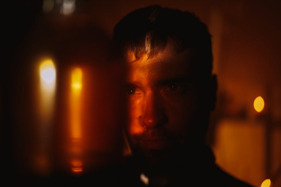
Backlighting and silhouettes create drama fast. You don’t need high detail just strong edges and smart shapes. Use rim light on a figure’s outline to suggest space, or punch up contrast between a bright background and a dark foreground. It sells depth even in flat compositions.
Gradients help guide the eye, but go easy. Push a transition across the frame sky to ground, shadow to light but mix in subtle texture so it doesn’t feel sterile. A gradient isn’t the star; it’s there to support the mood. If it looks too smooth, break it up with a brush pass or a bit of noise.
Mood lives in the small decisions. You don’t need a hundred layers just the right ones, placed with purpose.
When to Lead With Digital vs. Traditional
The question isn’t which medium is better it’s which one tells your story more clearly. Some visuals come alive through the chaos of charcoal or the bleed of ink on paper. Others need the precision and control only digital layers can deliver. Atmosphere demands intent, and your choice of medium should follow the tone you’re chasing.
Starting with traditional media can anchor your work in something tactile. There’s a gritty honesty to brush marks, smudges, and uneven ink flows that digital brushes just can’t fake. These textures, once scanned and layered digitally, give depth without trying too hard. Plus, you’ll spend less time searching for authenticity at the pixel level.
That said, if your concept leans heavily into lighting effects, surreal edits, or motion based layers, digital should probably lead. You can still fold in analog textures later for mood and grit. The key is making the digital process feel lived in not sterile. Use uneven edges, imperfect shapes, and overlapping elements that mimic the messiness of real materials.
Wherever you start, know what role each layer plays and keep it intentional. Want a refresher on the foundation? Brush up on digital painting basics.
Common Mistakes and How to Dodge Them
Even experienced artists working with mixed media can stumble into visual issues that flatten atmosphere or interrupt mood. Here are some of the most common pitfalls and how to steer clear of them.
Over layering Kills Emotion
Adding too many elements doesn’t necessarily build depth. In fact, it can lead to a muddy, overworked composition that loses its emotional resonance.
Resist the urge to pile on excessive textures or effects
Streamline layers to guide the viewer’s eye
Use atmosphere to enhance, not overwhelm, key focal points
Misusing Blend Modes or Filters
Blend modes are powerful tools if used intentionally. Over relying on them without understanding how they interact with colors and textures creates confusion, not cohesion.
Test each blending mode purposefully; don’t assume it will ‘just work’
Avoid stacking multiple filter effects unless they serve a clear mood
Keep saturation and contrast in check to avoid unnatural results
Losing Edge Control With Scanned Media
Scanned analog textures can bring authentic charm but they often have unwanted roughness. If not cleaned up or masked with care, they can create uneven transitions.
Zoom in to refine key edges and mask where needed
Blend traditional and digital touches smoothly to avoid harsh breaking points
Use layer masks instead of physically erasing details
Not Calibrating Lighting Across Layers
Each layer might look good on its own, but inconsistent lighting across your composition will break atmospheric unity.
Establish a single light source direction early in the process
Use gradient maps or selective toning layers to even things out
Check tonal values often especially when combining scanned and digital content
Mistakes are part of the process, but awareness turns them into learning opportunities. Cohesion and clarity matter just as much as complexity when constructing atmospheric artwork.
Pushing the Edge: Advanced Combos
When it comes to building atmospheric visuals that don’t feel cookie cutter, hybrid tricks from the analog world can set your work apart. Think paper tears, ink bleeds, or even smudges you’d normally toss aside. These tactile details, once digitized, serve as signature textures. Scan them. Layer them. Let the imperfections do the talking. A ripped corner can create tension. A bleed line can guide the eye.
Then add movement. Subtle motion blur or static noise if used smartly can define mood better than any filter. Blur oxides the sharpness, softening edges and adding mystery. Noise, when nuanced, gives your flat tones grit and a touch of grit translates to real. Use restraint. Too much and it looks messy, not moody.
Finally, scanned sketches aren’t just background filler they can act as tone maps. Drop the sketch underneath your paint layers, reduce opacity, and let the pencil work shape your lighting decisions or color pulls. It keeps the digital side from drifting into plastic perfection. The goal isn’t to mimic traditional it’s to build digital with soul.
Final Notes on Process and Experimentation
Atmospheric work doesn’t land in one pass. It builds over time, layer by layer a little detail here, a lighting tweak there. This type of visual storytelling thrives on iteration because mood is subtle and often unstable during early stages. What feels flat at first can become rich with a few patient refinements.
For that reason, save often and save in stages. Each major shift in tone, lighting, or texture should live in its own version. That gives you freedom to push forward without fear of losing a look that was almost there. You want the ability to backtrack or branch off if a direction starts to feel off.
This isn’t about perfection. It’s about paying attention. Trust your instincts when something clicks visually, but don’t stop there. Feel it, then dissect it: what’s working, what’s just noise, what could be made quieter or stronger. The process is part patience, part curiosity. The more you tweak with purpose, the more nuanced the final atmosphere becomes.
 Ismael Stansburyear has opinions about art exhibitions and reviews. Informed ones, backed by real experience — but opinions nonetheless, and they doesn't try to disguise them as neutral observation. They thinks a lot of what gets written about Art Exhibitions and Reviews, Artist Spotlights, Techniques and Tutorials is either too cautious to be useful or too confident to be credible, and they's work tends to sit deliberately in the space between those two failure modes.
Reading Ismael's pieces, you get the sense of someone who has thought about this stuff seriously and arrived at actual conclusions — not just collected a range of perspectives and declined to pick one. That can be uncomfortable when they lands on something you disagree with. It's also why the writing is worth engaging with. Ismael isn't interested in telling people what they want to hear. They is interested in telling them what they actually thinks, with enough reasoning behind it that you can push back if you want to. That kind of intellectual honesty is rarer than it should be.
What Ismael is best at is the moment when a familiar topic reveals something unexpected — when the conventional wisdom turns out to be slightly off, or when a small shift in framing changes everything. They finds those moments consistently, which is why they's work tends to generate real discussion rather than just passive agreement.
Ismael Stansburyear has opinions about art exhibitions and reviews. Informed ones, backed by real experience — but opinions nonetheless, and they doesn't try to disguise them as neutral observation. They thinks a lot of what gets written about Art Exhibitions and Reviews, Artist Spotlights, Techniques and Tutorials is either too cautious to be useful or too confident to be credible, and they's work tends to sit deliberately in the space between those two failure modes.
Reading Ismael's pieces, you get the sense of someone who has thought about this stuff seriously and arrived at actual conclusions — not just collected a range of perspectives and declined to pick one. That can be uncomfortable when they lands on something you disagree with. It's also why the writing is worth engaging with. Ismael isn't interested in telling people what they want to hear. They is interested in telling them what they actually thinks, with enough reasoning behind it that you can push back if you want to. That kind of intellectual honesty is rarer than it should be.
What Ismael is best at is the moment when a familiar topic reveals something unexpected — when the conventional wisdom turns out to be slightly off, or when a small shift in framing changes everything. They finds those moments consistently, which is why they's work tends to generate real discussion rather than just passive agreement.